
Start with a question, not a crowded screen
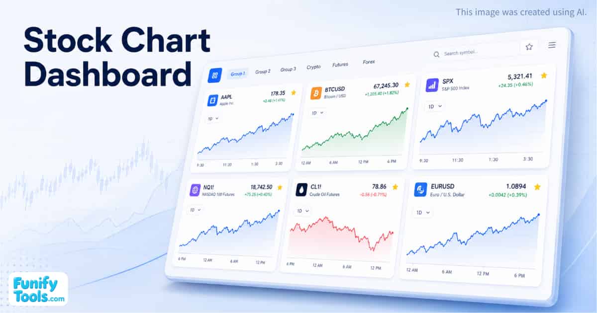
The most useful dashboard is rarely the one with the most charts. Begin with a question: Are semiconductor leaders moving together? Is a bank outperforming the broader market? Did today's headline change only one company or an entire industry? Add the smallest set of symbols that can help answer it.
A focused group might contain a company, two close competitors, a sector fund, and a broad index. That small arrangement gives every price move a reference point. If the company rises while the sector and market are flat, the move may be company-specific. If everything rises together, the larger market may be doing most of the work.
Let different timeframes challenge the first impression
The 1D view is intentionally the default because it reveals the shape of the current session. It is useful for noticing gaps, sharp reversals, late-day acceleration, and periods where price becomes unusually quiet. It is also the easiest view to overinterpret.
Move to 1M or 6M before forming a stronger opinion. A dramatic intraday drop can be a small pause inside a long advance, while a green day can be only a temporary bounce within a declining trend. The 1Y and 5Y views help reveal how exceptional—or ordinary—the current price really is.
Compare relationships instead of isolated numbers
Prices become more meaningful when arranged beside something related. Compare chipmakers with each other, a retailer with a consumer index, a bank with interest-rate-sensitive assets, or a multinational company with the currency that affects its overseas revenue. The goal is not to prove a theory instantly; it is to notice which relationship deserves deeper research.
Card order can turn the dashboard into a visual sentence. Place a broad benchmark first, an industry leader second, smaller competitors next, and a risk indicator last. When the same order is reused, unusual divergence becomes easier to spot because your eyes already know where each role belongs.
Choose a chart view that matches the question
An area chart makes the overall direction easy to scan and works well when many cards are visible at once. A line chart removes some visual weight and can make relative shapes easier to compare. Candlesticks contain more information about opening, closing, high, and low prices, but they also demand more attention. Use them when the details matter, not simply because they look more technical.
The moving-average option can provide a calmer reference through a noisy chart. Volume can reveal whether a sharp move attracted unusual participation. A percentage scale is useful when comparing instruments with very different prices, while a logarithmic scale can make long-term percentage growth easier to see. None of these options predicts what happens next; each merely changes which part of the existing history becomes easier to notice.
Color can carry meaning across a board. You might use one footer color for benchmarks, another for individual companies, and a third for currencies or crypto. Consistent color roles reduce the time needed to identify a card and help the dashboard remain readable as more symbols are added.
Use groups as separate research desks
Group 1 restores the default large-company board when reset. The remaining groups clear on reset, making them useful as temporary workspaces. You might dedicate one to long-term holdings, one to earnings season, one to international markets, and one to ideas discovered during the week.
Favorites work across those groups. Star a symbol when it repeatedly becomes relevant, then add it to another group without remembering the exchange code. This is especially useful for benchmarks or market leaders that provide context in several different comparisons.
Create a repeatable review routine
A dashboard becomes more useful when you review it in a consistent order. Before a market opens, scan broad indices and overnight instruments. During the session, look for changes in leadership and unusually large gaps between related cards. After the close, zoom out and ask whether the day altered the larger trend or merely added another small fluctuation.
A short routine can be more valuable than watching every tick. Start with the broad market, move to sectors, then inspect individual names that diverged. Star only the symbols that deserve follow-up. On the next visit, use those favorites to build a smaller research group rather than carrying every passing idea forward.
Consider recording the reason a symbol caught your attention outside this dashboard. A watchlist shows what moved, but a brief note preserves what you expected and why. Returning later to compare the chart with that original thought is one of the simplest ways to improve your own research process.
Know what the dashboard does—and what it does not
The embedded TradingView widget manages chart rendering and quote updates. During an active market session, displayed values may update automatically, but exchange rules can introduce delays. A delay marker beside a quote means the number should not be treated as an execution price.
Settings, groups, order, and favorites are stored in this browser. They are convenient for a personal workspace but are not synchronized as a brokerage watchlist or cloud portfolio. Clearing browser storage can remove them, and the dashboard does not calculate gains, cost basis, dividends, taxes, or portfolio risk.
Use the board to discover questions, then verify important conclusions with company filings, official exchange information, and appropriate financial research. A compelling chart can reveal where to look; it cannot explain every reason a market moved.
Questions worth asking when a chart stands out
- Is the move unique to this company, or are its peers moving too?
- Did volume expand, or did price move on relatively quiet trading?
- Does the same move still look important on the one-month and one-year views?
- Was the relevant exchange open, in an extended session, or already closed?
- Could earnings, guidance, economic data, currency moves, or a sector-wide event provide context?
- Am I looking at a real-time quote or exchange-delayed data?
These questions turn the dashboard from a passive display into a starting point for investigation. The objective is not to react faster to every colored number. It is to notice meaningful differences, slow down the first impression, and decide what deserves a closer look.