What this guide covers
Word art works best when the message is short, the font matches the use case, and the curve supports readability instead of fighting it. This comprehensive guide covers everything from basic setup and font selection to advanced styling techniques, curve configurations, export best practices, and real-world application scenarios. Whether you are creating social media graphics, educational materials, presentation titles, game-style thumbnail text, video intro titles, or personal project logos, understanding each control helps you produce professional-looking word art every time. The word art generator runs entirely in your browser using Fabric.js for 2D rendering and Three.js for 3D WebGL rendering, ensuring fast performance and complete privacy since no data is ever uploaded to a server.
Basics of word art creation
Start with one or two words and choose a readable font. Then increase the canvas size before using extreme spacing, rotation, or curve values. This keeps the text clear on thumbnails, class materials, slides, and banners. The word art generator processes everything locally in your browser, which means no image uploads and no server round trips. Your text stays private and you get instant visual feedback as you adjust each parameter. For beginners, a recommended workflow is to type your text first, pick a font that matches the tone of your message, adjust the canvas dimensions to fit your target output, and then experiment with curve settings, colors, and shadow effects. Each change updates the preview in real time so you can see exactly how the final result will look before you export. The canvas size directly affects output quality, so choose dimensions that match your intended use case early in the design process. For the best results, always design at or near your final output resolution to avoid unexpected scaling artifacts.
Design tips for better word art
- Use strong color contrast between the main color and the gradient color to make the text pop. Light text on a dark gradient or dark text with a bright highlight creates the most readable results across different display types and background colors.
- Keep highly decorative fonts short because complex letter shapes reduce readability, especially at small canvas sizes or when curved aggressively. Script and handwriting fonts work best for single words or short phrases up to eight characters.
- Adjust curve width and curve bend before adding heavy rotation. The curve parameters define the overall arc of your text, and extreme rotation on top of a tight curve can make letters overlap or become unreadable. Start with a gentle curve and increase gradually.
- Use transparent PNG export when the artwork will be placed on another design, slide deck, website mockup, or video overlay. A transparent background gives you maximum flexibility in downstream tools and eliminates the need to match background colors manually.
- For multi line word art, keep each line short and adjust line spacing to avoid crowding. Three to five words per line typically produces the best visual balance, and generous line spacing improves overall readability.
- Test your word art at the actual output size before finalizing. What looks good in the editor preview may appear too small or too large at the intended display dimensions. Use the canvas size controls to match your target output resolution.
2D and 3D comparison
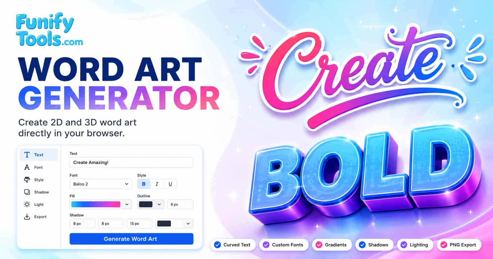
The word art generator offers two distinct rendering modes, each optimized for different creative needs. In 2D mode, the tool uses Fabric.js canvas rendering to produce fast, lightweight text graphics that work on every device and browser without special hardware requirements. 2D mode is ideal for quick badges, labels, worksheets, simple title graphics, and social media headers where speed and broad compatibility matter most. The main controls in 2D mode include font selection, gradient colors, shadow effects, curve width and bend, rotation angle, and canvas dimensions. In 3D mode, the tool switches to Three.js WebGL rendering to create extruded text with depth, lighting, and perspective effects. 3D mode is best suited for poster-style titles, game-style text, dramatic thumbnail concepts, and video intro graphics where visual impact is the top priority. The main controls in 3D mode include extruded text depth, light color and position, light intensity, camera zoom, and three dimensional rotation. You can switch between modes at any time without losing your text or style settings, making it easy to compare how your design looks in both rendering styles before exporting.
Export tips
Before downloading, check the canvas size and background option. If you plan to reuse the artwork in a slide deck, website mockup, or another editor, transparent background is usually the most flexible choice. For social media posts and thumbnails, match your canvas dimensions to the platform recommended image size for the best display quality. The PNG export preserves all visual details including gradients, shadows, and 3D lighting effects, so you can rely on the downloaded file matching what you see in the live preview. For 3D mode exports, a larger canvas size between 800 by 600 and 1200 by 800 pixels is recommended to fully capture the depth and lighting details of extruded text. For 2D mode exports, canvas sizes between 400 by 400 and 800 by 800 pixels are typically sufficient for most use cases. Always review the final preview at full zoom level before downloading to catch any alignment, spacing, or readability issues.
Font selection guide
Choosing the right font is one of the most important decisions when creating word art. The word art generator includes a curated selection of Google Fonts that cover a wide range of styles, from elegant scripts to bold display typefaces. Below is a comparison table to help you match fonts to specific use cases and understand their visual characteristics.
| Font name | Style category | Best use case | Recommended max length |
|---|---|---|---|
| Pacifico | Script / Handwriting | Social media headers, greeting cards, casual branding | 1-2 words |
| Lobster | Script / Display | Poster titles, food blog headers, event announcements | 2-3 words |
| Bebas Neue | Sans-serif / Condensed | Thumbnail text, YouTube titles, bold headlines | 3-5 words |
| Montserrat | Sans-serif / Modern | Presentations, educational materials, corporate graphics | 5+ words |
| Press Start 2P | Pixel / Retro | Game style text, retro graphics, pixel art banners | 1-2 words |
| Dancing Script | Script / Casual | Wedding invitations, romantic quotes, decorative badges | 1-3 words |
| Oswald | Sans-serif / Narrow | News style headlines, sports graphics, infographic titles | 3-5 words |
| Rubik Glitch | Display / Distorted | Cyberpunk themes, tech events, experimental art | 1-2 words |
When selecting a font, consider the emotional tone you want to convey. Script fonts like Pacifico and Dancing Script feel friendly and artistic. Bold condensed fonts like Bebas Neue and Oswald project strength and modernity. Decorative fonts like Press Start 2P and Rubik Glitch create strong thematic associations but should be used sparingly for maximum impact. For multilingual word art, sans-serif fonts such as Montserrat and Open Sans offer the broadest language support and most consistent rendering across different character sets.
Use cases and practical applications
Word art can be applied to a wide variety of creative projects. The following tables organize common use cases by output format and industry to help you quickly identify the optimal settings for your specific project. Understanding the relationship between canvas dimensions, font style, rendering mode, and export format is key to achieving professional results.
| Use case | Recommended mode | Canvas size (px) | Font style | Key settings |
|---|---|---|---|---|
| YouTube thumbnail title | 2D or 3D | 1280 x 720 | Bold sans-serif (Bebas Neue, Oswald) | Short text, high contrast, strong shadow |
| Social media quote graphic | 2D | 1080 x 1080 | Script or serif (Pacifico, Lobster) | Gentle curve, gradient colors, transparent bg |
| Presentation slide title | 2D | 1920 x 1080 | Modern sans-serif (Montserrat, Raleway) | Large font size, subtle shadow, no curve |
| Game style banner | 3D | 800 x 600 | Retro or display (Press Start 2P, Anton) | Extruded depth, dramatic lighting, camera zoom |
| Educational worksheet header | 2D | 600 x 200 | Clean sans-serif (Open Sans, Roboto) | No curve, clear spacing, readable font size |
| Video intro title | 3D | 1200 x 800 | Bold display (Anton, Bebas Neue) | Extruded text, light position, transparent bg |
| Event poster headline | 2D or 3D | 1000 x 1400 | Narrow sans-serif (Oswald, Bebas Neue) | Large canvas, curved text, strong gradient |
| Personal logo or badge | 2D | 400 x 400 | Script or custom (Dancing Script, Pacifico) | Short text, transparent bg, shadow effect |
Each use case benefits from a specific combination of settings. For YouTube thumbnails, bold sans-serif fonts with strong shadow effects and high contrast colors ensure readability at small display sizes. Social media quote graphics shine with script fonts, gentle curves, and transparent backgrounds that allow the artwork to blend seamlessly with any feed layout. Educational materials require clean readable fonts, generous spacing, and minimal decoration to maintain clarity. Video intro titles benefit from 3D mode with extruded text and dynamic lighting to create a professional broadcast style appearance.
| Industry | Common formats | Recommended fonts | Typical canvas size | Style notes |
|---|---|---|---|---|
| Education | Worksheets, slides, handouts | Open Sans, Roboto, Montserrat | 600 x 200 to 1920 x 1080 | Clean, readable, minimal decoration |
| Social media marketing | Instagram posts, Facebook covers, Twitter headers | Pacifico, Lobster, Bebas Neue | 1080 x 1080 to 1500 x 500 | Bold colors, curves, transparent bg |
| Gaming and streaming | Thumbnails, overlays, banners | Press Start 2P, Anton, Bebas Neue | 1280 x 720 to 1920 x 1080 | 3D mode, dramatic lighting, strong shadows |
| Event and hospitality | Posters, flyers, menus | Dancing Script, Lobster, Oswald | 800 x 1200 to 1000 x 1400 | Elegant fonts, gentle curves, warm gradients |
| Technology and startups | Presentation slides, product mockups | Montserrat, Raleway, Open Sans | 1920 x 1080 to 1200 x 800 | Modern sans-serif, subtle effects, clean layout |
| Creative and personal branding | Logos, badges, portfolio headers | Pacifico, Rubik Glitch, UnifrakturMaguntia | 400 x 400 to 800 x 400 | Unique fonts, transparent bg, shadow effects |
By matching your canvas dimensions, font choice, rendering mode, and style settings to your specific use case, you can create word art that looks purpose built for its intended medium. Experiment with different combinations using the live preview to refine your design before exporting. The word art generator gives you the flexibility to iterate quickly and explore multiple creative directions without leaving your browser.